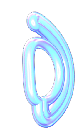
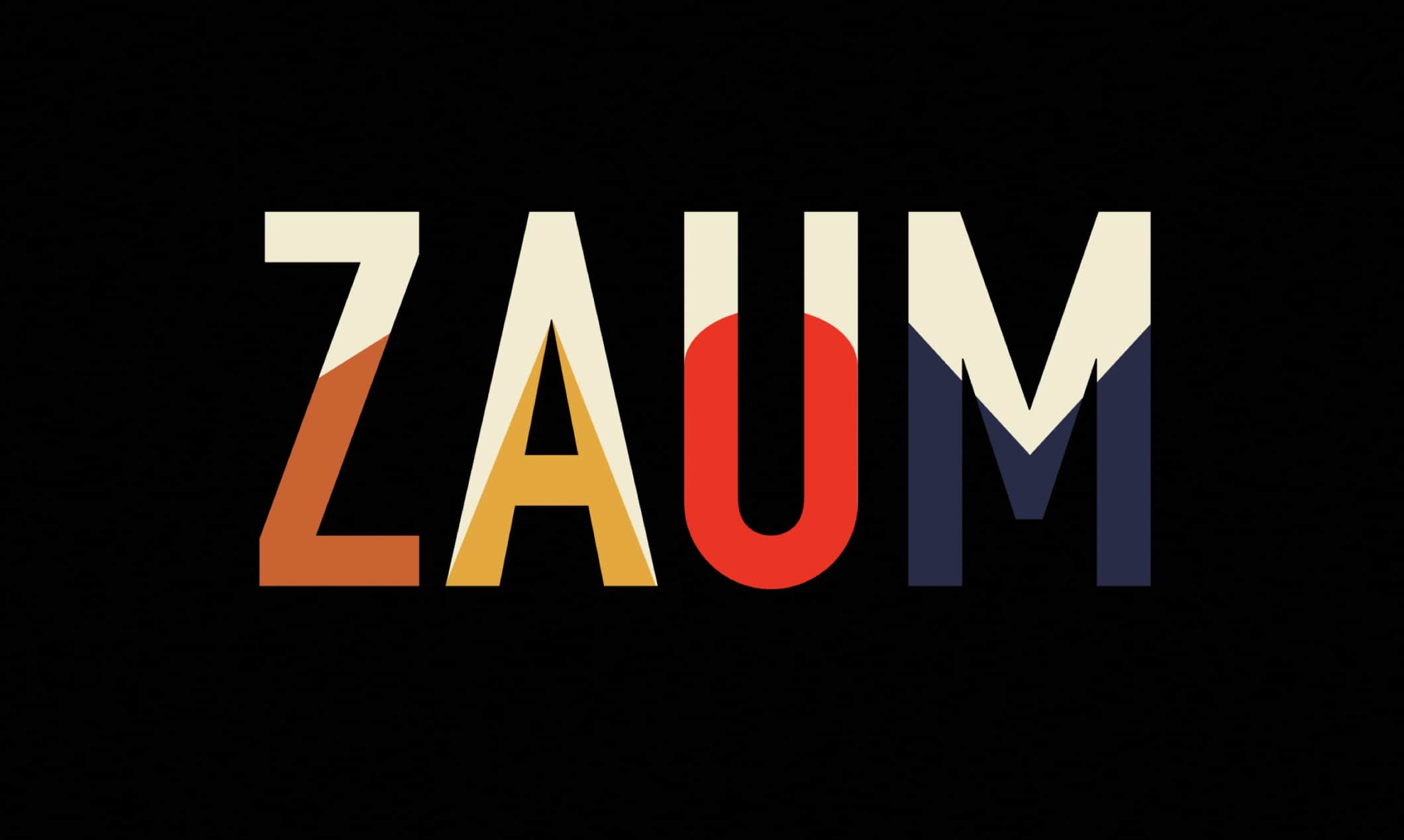
ZAUM is a storytelling company based at the foot of the Manhattan Bridge in Brooklyn. This project explored Russian constructionist art to produce an identity and website inspired by warm tones and sharp shapes.
The Task
ZAUM was brand new and needed a logo, some light branding, and a single page website that captured and presented their mood and mission.


The Process
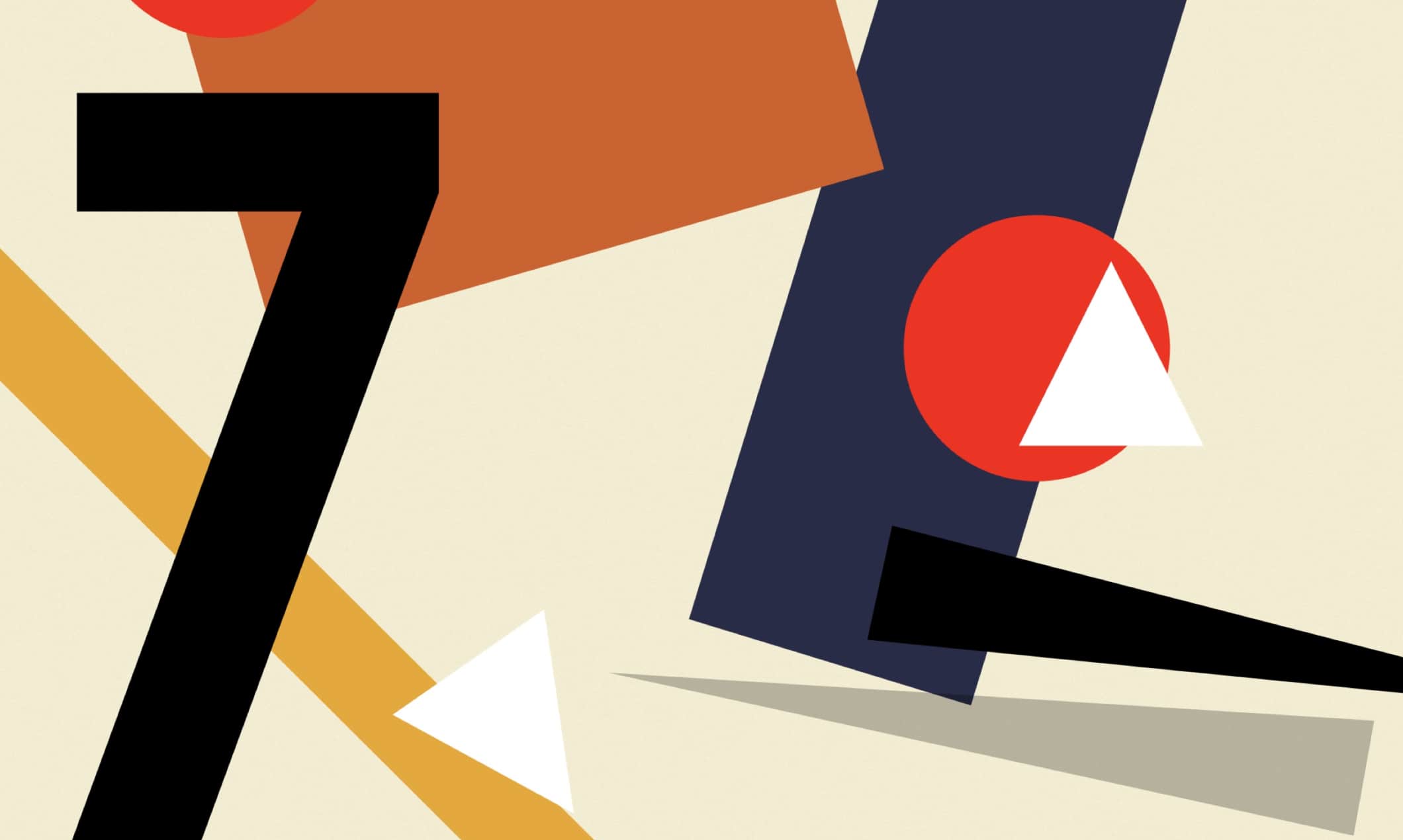
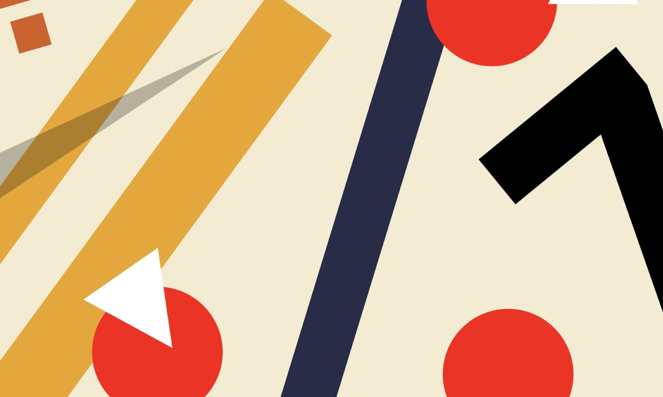
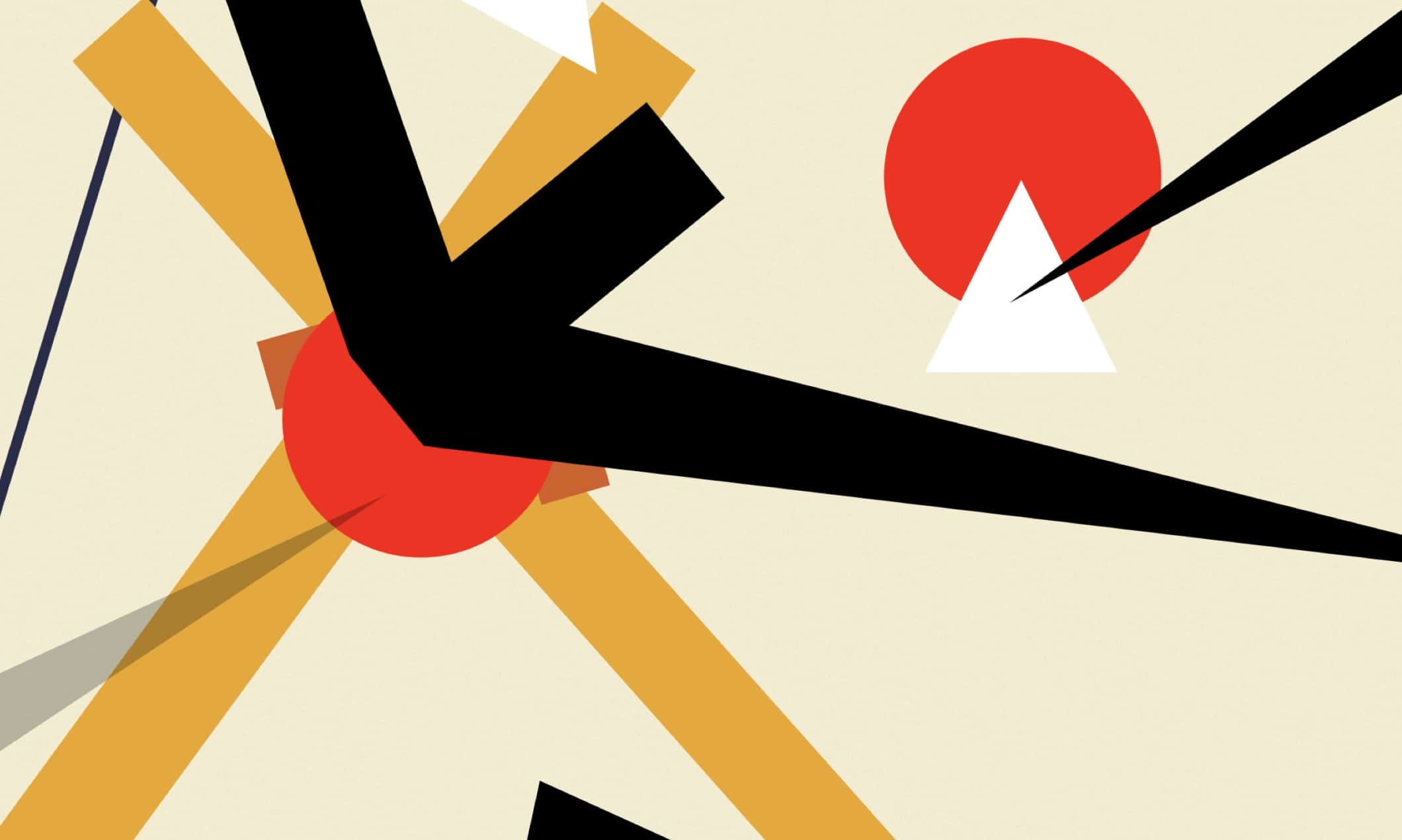
I started exploring and gleaning Russian constructivist artwork and created a play set of shapes and colors that encapsulated that. Then I established the logo type to align with this shape set and continued to work out creation of the logo and other brand elements.
Finally, I took everything I learned and crafted a succinct design that captured the brand while presenting samples of work.
The Solution
The ZAUM logo and website turned out great. Chock full of great little details like scrolling animations, glitchy text, and collections of shapes that appear to be breathing.
It remains a great experience emoting a very pleasant visual texture and experience.
The Highlights
- A timeless single page website with simple and effective scrolling animations powered by GSAP.
- A logo and color palette that do a great job of representing ZAUM.
